
How modern prospectus design can convey your school’s heritage
I got to talking with a school prospectus client recently about school branding and prospectus design. The conversation wandered around other schools they knew and our previous designs for other schools, but soon focussed on how they wanted to be perceived in the community, and how a school’s branding can really influence potential parents’ perceptions.
They responded “we’re a strong pillar in our community, long established with deep roots and a strong sense of tradition. That said, we don’t do things the ‘old’ way, we are forward-thinking and modern in our approach, but how do we communicate this through our marketing?”
So, this is the interesting bit, how do you marry traditional heritage with modern approach? Through thoughtful design and copywriting, in short. But here’s a bit more detail…
Firstly, what is design? And why does good design matter?
Design runs much deeper than how something looks. In context of schools, consider design like the multi-faceted personality of a memorable school, it’s not just the logo, it’s a host of intentional design decisions from the choice of colours, typography, tone of voice, photography, graphics, school prospectus and associated brochures, website, signage, open days, the whole communication, presentation or ‘feel’ of the school.
Good design matters because people are visually stimulated, and, in the nanoseconds of attention you have with someone, leaving a good impression is really important. Good design should be experienced, rather than noticed. When done well, it’s likely you won’t notice the design at all, you’ll just consume the content easily and pleasurably.
When it’s essentially invisible it’s all too easy to undervalue design but investing in good design will set you apart, build trust and make your school shine.
How can design capture the ‘feeling’ of your school and convey your heritage in your prospectus?
A good designer will employ all the tools at their expert disposal, typography, styling, colours, imagery and photography. If your school has a rich heritage, a strong reputation and confident claims, here’s a quick list of a few key design considerations that might be useful for your next school prospectus design brief:
Typography
Titles and headings in a modern font, working with a more traditional body copy font. Here are a few font pairings that reflect the for inspiration.
Future Bold / Souvenir – Futura is bold, optimistic and serious, whilst Souvenir is playful and light – a clean and quirky pairing.

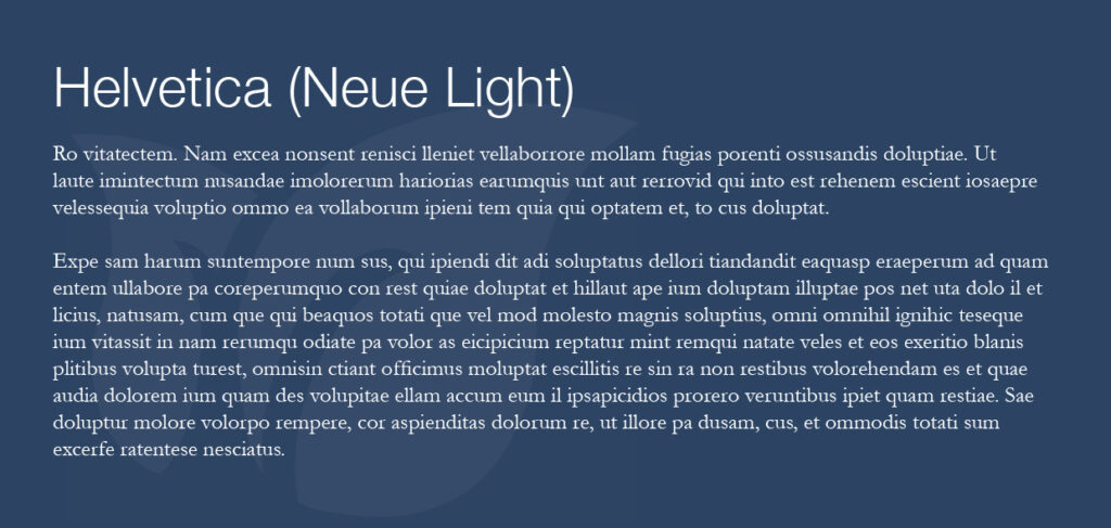
Helvetica Neue / Garamond – using these two timeless classics invites your reader into a world of elegance and tradition.
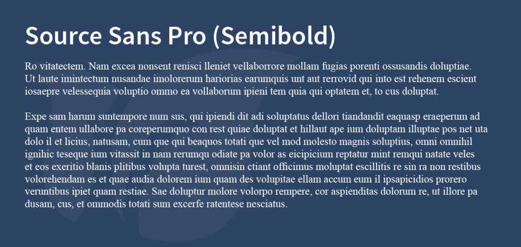
Source Sans Pro / Times New Roman – familiar, conventional is what you’ll get from the ubiquitous Times New Roman but paired with Source Sans Pro it lifts into a modern and timeless pair.
Print Finishes and materials
The key to your school prospectus instantly ‘feeling’ like something special is the choice of printing paper, or stock. Use of an elegant silk stock will give you consistent colour vibrancy, increased readability and durability. Highlight key design elements or messages with an eye- catching and tactile spot UV gloss varnish.
Design and photography
Simple, clean and modern, confident use of empty/white space and layout to illustrate confidence and tradition whilst marrying this with bright and enriched photos showcasing modern facilities and learning strategies.
Colours
You’ll use your school brand colours first and foremost, but it’s useful to decide on a complimentary secondary palette for your prospectus design to give your designer scope. Select colours that nod to the past (more subtle muted tones) working together with a brighter accent colour to lift the design. Check out some themed colour palettes below:
![]()
![]()
![]()
Language and copy
Ensure a balance between acknowledging the past and tradition of your school but writing the copy in a more modern ‘accessible’ tone; keep it lighter yet still informative. And, importantly, don’t overwrite. Keep it succinct, to the point, give the copy space to breathe on the page, not crammed into every corner.
Carefully combining these design considerations can create an elegant enduring school prospectus design that is memorable and modern, yet classic.
If you’re about to start work on a new school prospectus, website or update your school logo or brand, get in touch with us to discuss your next project, we’d love to help.
Get in touch with us to discuss your next school prospectus.